


Welcome YouTubers! Provide your name and email below to download the original “before” and “after” jpeg elevations that accompanies the Draw-Along exercise, PLUS my original .procreate file (so you can see the layers watch the video replay at your own pace).
Download Images Used In Sketchup For iPad Draw-Along Tutorial
Welcome YouTubers! Provide your name and email below to download the elevation that accompanies this Draw-Along exercise.
Download My Original .Procreate File To Study Layers & Watch Video Replay At Your Leisure
See how my strategy for making the rendering in the video below would compare with yours, and get the maximum value from this tutorial.

Follow Along With My Original .procreate File

Download my original .procreate file and follow along with the YouTube tutorial
To follow along with the YouTube tutorial for this rendering, download the $1.99 original .procreate file here. It ‘s your file to learn from any way you wish. Browse and interact with the original layers; see the thinking behind the construction of the image from bottom to top of the layer stack; see the individual brush strokes used; access the canvas info; activate the video replay as often as you wish; adjust the hue, saturation, brightness and blending modes of any layer; select, delete, copy and duplicate any layer to observe the effects. The file is yours to dissect and learn from.
Thanks for studying along with this tutorial. Let me know if you enjoy this approach in the comments below.
Download This Free 1-Click Guide To My 120+ "iPad For Architects" Tutorials

I recently re-organized all the videos on my channel into playlists that would automatically lead viewers from one related video to the next, then built an interactive spreadsheet that allows you to sort the content any way you want, so you can click on only the links of the the episodes you want to see (or see again), when you want to see them. Click above to receive free guide. (Zip file will contain an Excel, Numbers and PDF version of spreadsheet)
With gratitude for your support,
James
jakers3@gmail.com
Watercolor Portrait of Pit Bull Rescue Dog "Diana"
This is a 2-hr watercolor portrait on 90 lbs cold press, made from looking at a photograph, but not tracing. Notice the pencil construction lines used to develop 3-d forms of Diana’s head, torso, etc. Large multi-color wash was used to create dark background, then developed in 2-3 subsequent layers. As background was drying, details of Diana were painted, careful to avoid touching still-wet outline of the figure. All wash were kept as loose and liquid as possible, so they mix on their own and find their own character in the texture of the paper.
My Dad Is the Greatest
My dad is 95 years old and and it’s taken me this long to realize I’ve never told him how much I appreciate everything he taught me and did for me over the years, so I thought I’d take a moment now before he goes and does something that makes me rethink all of this.
My earliest memory of my dad—and I’m checking with my siblings now to see if this is even possible—was when my mom and dad chaperoned our Aunt NeeNee down to Nassau in the Bahamas, after her 14-yr old daughter died in a tragic but avoidable Jeep accident in 1957. (Click here or google: “Lee McKinney Titusville” for details)
One-years old at the time, I have no memory of the news hitting the family, but I think I remember mom and dad being gone for what seemed like a month, with me and my two older siblings Sue and John being looked after in our big, dark house by our babysitter “Mitts” (a mispronunciation of “Mrs. Smith” invented by the neighborhood kids she took care of). What pins the moment in time is the image of my dad moving the upstairs den TV to the downstairs living room, no small feat in the era of 200 pound TVs. He was trying to make life easier for “Mitts” but in the process he thrilled us kids that we could “watch TV in the Living Room.” That’s my dad: solving problems with unforgettable solutions.

Approximate representation of our 1960s era family TV
The TV was the first in a life-long series of household kluges and hacks my dad was always inventing to make life better for all of us.
If it’s true kids learn from what their parents do, not what they say, then our house was a university of life and dad was its professor emeritus. Watching him lose himself in a project, seeing the pride he took in the quality of his work, observing his happiness in a “flow state" taught me the value in thoughtful problem solving and creatively providing for others.
The places dad loved were the places I spent long hours observing him and absorbing his values: the shop, the den, the barn, the back patio, the screen porch, the living room; every one of our all-too-short vacations. In these places he seemed happiest and most relaxed, so I learned to be happy and relaxed in those places, too.
In the den, I learned from Dad that nothing beats being with family. He‘d sit at his desk for hours—nights and weekends—paying bills, watching TV, unknowingly providing the lighthouse that I looked for in dark times. He paid the bills and ran the family finances in there, but the TV was in there, too, so you could always get “dad time” just going in there and hanging out.
That’s where I learned what made him laugh (Laurel and Hardy, F Troop, Tim Conway, Flip Wilson, George Carlin); how to build a perfect fire; how to adjust the logs that weren't burning in a perfect fire; how to pay bills while enjoying that fire. The den was where you could catch dad off-guard, deep in thought, or falling asleep at the telly. When life presented challenges, there was always Dad in that room. That’s where you could feel close to him when you needed him, but lacked the words to tell him.
In the shop, Dad taught a different masterclass: how to use every kind of tool: how to put things together and take them apart; how to keep an aging house running in top shape; the simple joy to be found immersing oneself in a project. He always had something going on down there, and when he wasn’t there, it was the place you could go to try the tools he forbid you to use, or explore 30 years accumulation of obsolete bits of electronics, or just feel his presence.
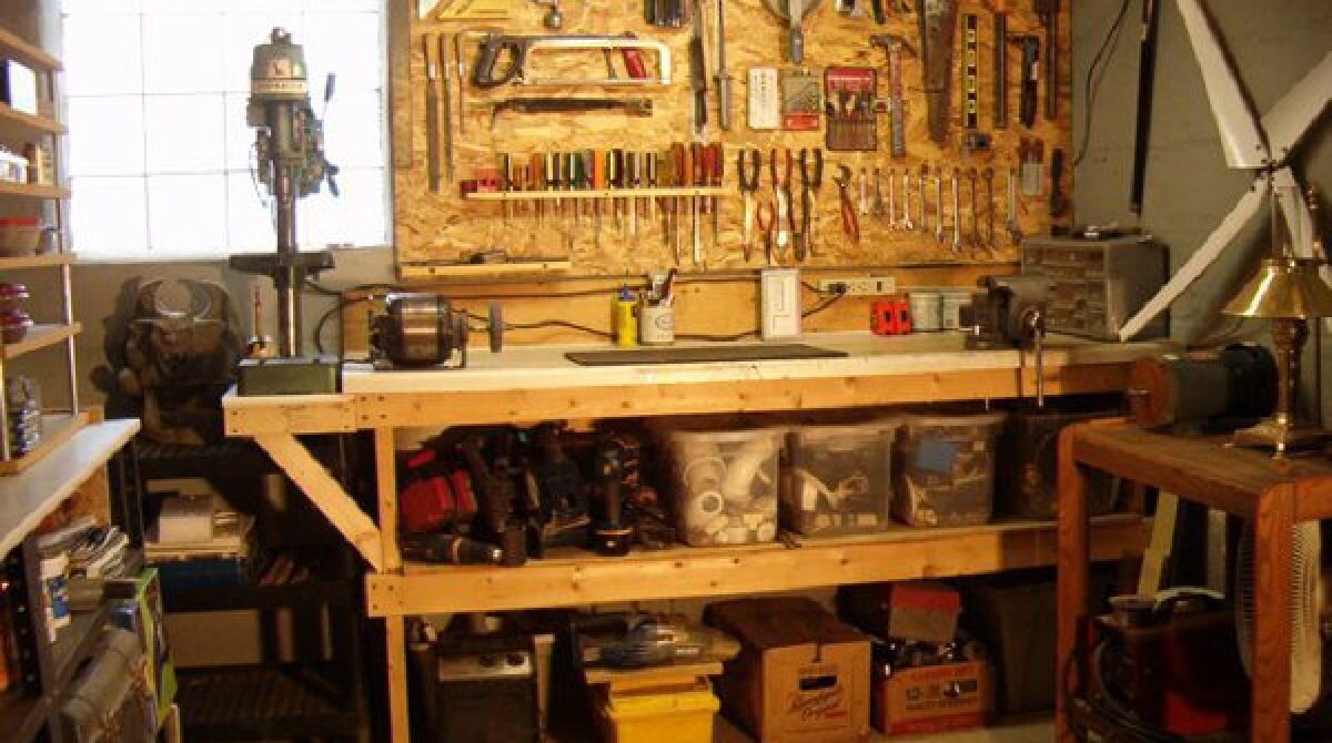
A shop very similar to Dad’s…but cleaner and better organized
There was wonder in the temporary gizmos he cobbled together, dreamt up on a project-by-project basis: shop lamps clipped to Dr. Seuss wooden arms hovering over dangerous saw beds; networks of overhead extension cords, throwaway racks holding every size screwdrivers and drill bits. Being amongst those tools and clutter made we want to have a shop of my own in every place I live. And when I’m in that shop, I see my dad doing his thing, counter-sinking screws with a brace-and-bit, smoking a pipe, sipping a Ballantine beer, happy in that flow state.
The screen porch was where my dad taught me how to relax in summer. The lesson: always have a place in your life where you can be close to the sound of crickets, summer breezes and summer downpours, then be happy just to chill while you read the newspaper or watch Masterpiece Theater on PBS.
Behind the house off the screen porch was the patio, where Dad taught any of us paying attention how to build a rock garden, how to move huge boulders from the front woods to the backyard using Egyptian-style wooden rollers, how to grill meat, how to swirl ice cubes in a gin and tonic, how to take a minute between flips of meat to throw a football or play badminton with your kid. When I went through a strange phase of sundown depression and sleeplessness as a middle schooler, I made a beeline to hang out with dad in the backyard every evening, soon as he came home from work. I had no idea what was going on inside my head, and I don’t think he knew what I was going through; I just knew being with him and watching his reassuring routine was the answer.
In the garage, Dad taught us how to be entrepreneurs while serving our community. Dad dreamt up a way to raise money for Indian Guides by buying hundreds of bags of charcoal at bulk rate, then selling them around the neighborhood at a slightly marked-up rate, for the good of the organization. I remember trucks coming to the house, unloading industrial palettes of charcoal at the doorway of our garage, then me and my buddies stacking them out of the rain, having no idea we were doing something good for others. It was a chore, but it seemed like fun. Dad went a step further and conjured a cart from old fertilized-spreader wheels and wood slats, so we could deliver the charcoal people ordered. This taught me the equally important lesson that you should test a design before you build it. The wheels of that prototype scraped the road and ground it to a halt if you tilted the cart off horizontal so much as 5 degrees.
When my parents left the east coast and retired to Mayville, NY, the coolest places in their new family compound were the garage shop and the boathouse. Just seeing all Dad’s tools relocated to that new house and on display again inspired creativity; whether one used them or not, they always extended the invitation to make something.
Many of the values I hold dearest come from my dad and his projects, but he also taught us there was joy and togetherness in:
eating as a family at the Dining Room table;
playing games in the backyard;
Reading the paper, drinking coffee and listening to music in the Living Room on Sunday mornings after church;
Saturday morning drives to the Dry Cleaner and Hardware store;
family picnics at The Murphy house and Jockey Hollow and Granny’s house
the Windjammer weekend sail on the Chesapeake;
Indian Guides meetings where fathers and sons bonded during school nights;
All-too-brief one-off vacations over a three-year period in Menauhant, Cape Cod: Menemsha Pond, Martha’s Vineyard; and Wauwinet, Nantucket;
Family trips to the ’64 World’s Fair in Flushing Meadows, NY, and Expo 67 in Montreal;
Long summer stays and genteel family visits on the porch at Granny Warner’s in Titusville, PA;
Long 12-hour car trips to even get to Granny’s before Rte 80 was finished;
Of course, weekends and vacations are just logical times a kid who loved his weekday-commuting dad would remember, but it was something else, too.
It was observing his authentic self in these settings where I learned the values of patience, industry, humor, soft spoken civility, community-mindedness, honest self-examination, appreciation for the arts and culture, responsibility to family and friends, joy in expressing oneself in music and art, respect for others and their ideas, gracious admission of error, wisdom in seeking the counsel of others, and the difference between listening and hearing.
But the main lesson learned was one he could not have been aware of, but the one I am most grateful for: You will always find “the real me” in these places, and I am always here for you.
I love you, Dad.
Thanks for everything you gave us and continue to give us.
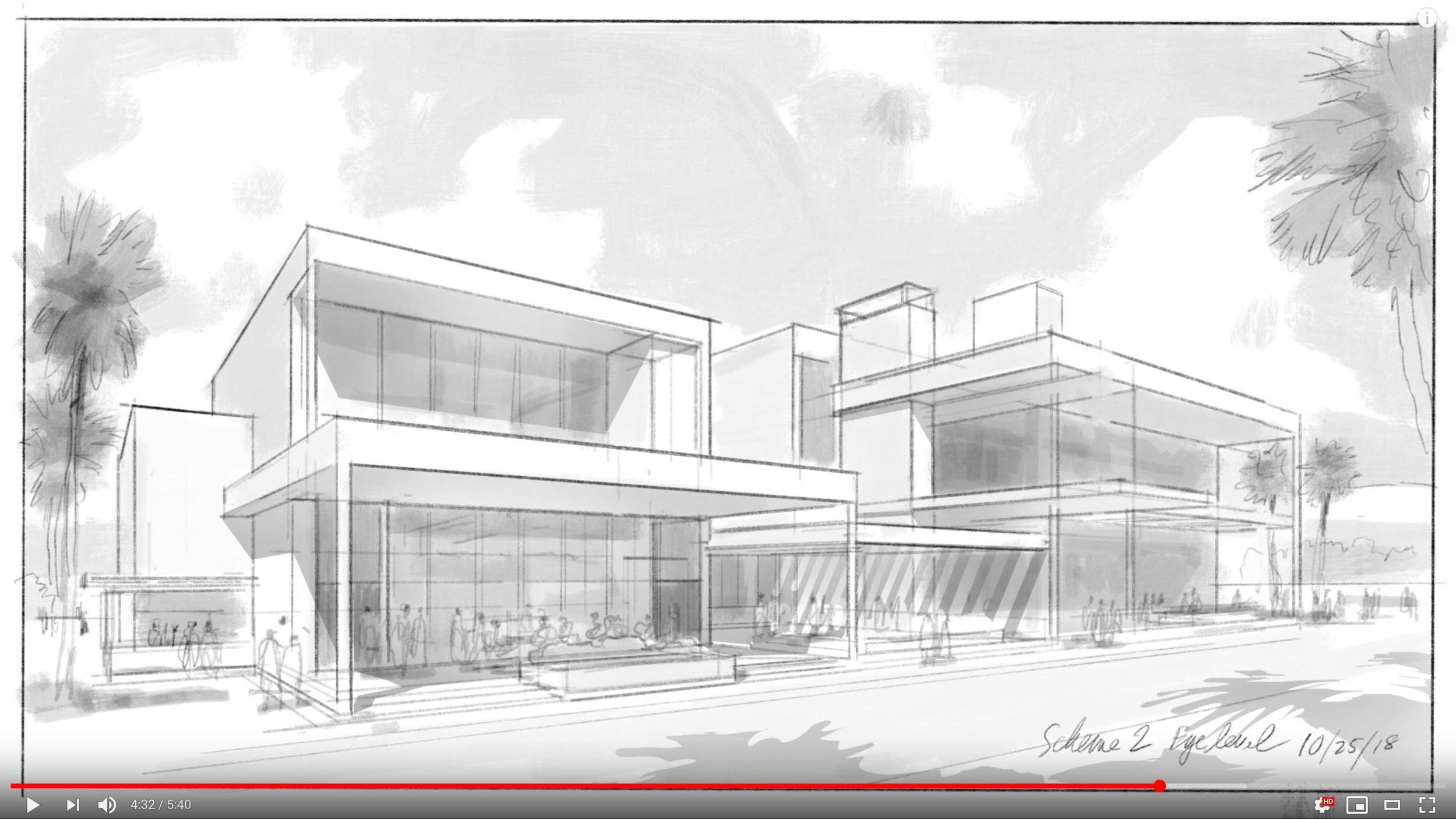
Assets for "A Simple Rendering Exercise...Episode 2"
Welcome Pro-creators. To draw along with the YouTube tutorial, download a free .PDF of the background photos assets. (sorry, Squarespace only allows downloads in .pdf format). Once downloaded:
convert pdf images to jpegs or screenshot .pngs so Procreate can import them;
make new Procreate canvas with dimensions below;
import photos into new canvas and begin

Add a new canvas with these specs


You can also download the original .procreate project file and study it along with the video to see my process, including every good (and bad) decision I made as I created this rendering in real time. No editing, no narration, just the actual original project file you can explore, alter and add to. It ‘s your file to learn from any way you wish. Browse and interact with the original layers; see the thinking behind the construction of the image from bottom to top of the layer stack; see the individual brush strokes used; access the canvas info; activate the video replay as often as you wish; adjust the hue, saturation, brightness and blending modes of any layer; select, delete, copy and duplicate any layer to observe the effects. The file is yours to dissect and learn from. Just click HERE. )
Thanks for drawing along with the tutorial. Let me know if you enjoy this approach in the comments below.
Can You *Really* Design In Procreate?? | Procreate for Designers

Can architects and designers *really* design in Procreate, or is it just a glorified digital sketchbook? In today's tutorial for architects, designers and students, I demonstrate the "super powers" of Procreate that make it the ideal choice to imagine your design, develop it in scale, then hand it off for further development in Rhino or Sketchup. What makes Procreate such a powerful design tool is that it combines the best of both worlds…
15 Of The Dumbest Things You'd Ever Want To Know About Watercolor Technique...That Work Every Time
Dear Pinterest: By popular request “15 Of The Dumbest Things You'd Ever Want To Know About Watercolor Technique...That Work Every Time” is now available as a soft cover 7” x 7” book, e-book, or convenient phone-sized .PDF. To see purchase options click button below, and thank you for your support!

Excerpts from the book:
INTRODUCTION
This is the shortest, easiest to read book ever written about watercolor. The idea is to share with you 15 of the “dumbest” (i.e. simple; time-saving; true) things I wish someone had told me when I was first learning. Why? Because you are a procrastinator like me and I want to make it easy and fun for you to get over the hump. So read it in a short checkout line, or open it next to your new palette, then I want to see that paint fly, OK? Go.
WHY WATERCOLOR?
Because it’s relaxing and fun, and you’ll feel really good about yourself. Watercoloring helps you see the world around you and live in the moment. And if you do the exercises in this book you’ll have lots of little little paintings to be proud of and keep for your grandkids.

A little painting to be proud of and keep for your grandkids
#1: KEEP IT SIMPLE
Keep your subjects simple and you’ll paint every day. Keep your art supplies simple and you’ll use them more. Keep your ambitions simple and you’ll be more forgiving. Keep your resolve simple and you’ll practice more often.
The opposite of complexity is simplicity. The more complicated the steps in learning something new, the less likely we are to try it. Therefore #1 dumb thing in this book is “Keep it Simple.”

Watercolor is just “color juice” as my friend Clark Smith says.. Play at it, and you can only get better

#3: TRANSPARENT MOTIVES
The main difference between watercolor and oil or acrylic is that it dries quickly and remains transparent after drying, so the color of the paper and any paint already applied shows through layers of new paint. The effect is sometimes referred to as “glow.”
To see what I mean, replicate the exercise above with thin layers of paint, letting each layer dry before applying the next (about 30 to 45 seconds should do; shorter with a hair dryer). Try to leave some tiny gaps between brush strokes, so glimpses of the underlying paper and paint persist to the end.
Be sure to leave gaps in your brush strokes where the paper and paints under each new layer can show through
These primary colors are known for their staining properties and relative lack of transparency, They allow less light to pass through to underlying paper and paint, but often they’re exactly what you need
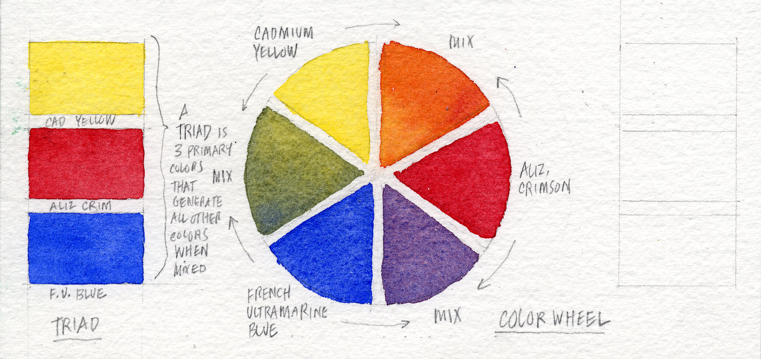
#4: LOVE YOU SOME TRIANGLE
The color wheel helps us visualize the relationships between primary and secondary colors. It begins with a “triad” of three colors—yellow, red and blue—spaced equally around a “wheel.” Next come the three secondary colors, located between the primary colors, and created by mixing the primaries on either side.
Can you get every shade of every color this way? No, but depending on the particular primary colors you use, you can get close. Should you need more colors, Mr. Winsor & Mr. Newton have your back.

Another little painting you could keep for your kids, come to think of it

Here's one example of how the palette and brushes described in this post might look in the real world. Notice the paper towel and strips of scrap paper used to test the color and opacity of the watercolors I mix before painting
MIXING COLORS
The best way to introduce the idea of mixing colors is to have you mix the ugliest color: gray. (We're going to mix abut 50 shades of it, so make sure you're in a safe place.) Why gray? Because gray is what you get when you mix opposites on the color wheel. Mixing gray will help both your understanding of the color wheel and your understanding of another concept: color temperature. What is color temperature? It's the degree of warmth or coolness found in a color, usually having to do with the amount of red or blue found in the color. But we get ahead of ourselves. Let's try mixing some grays.
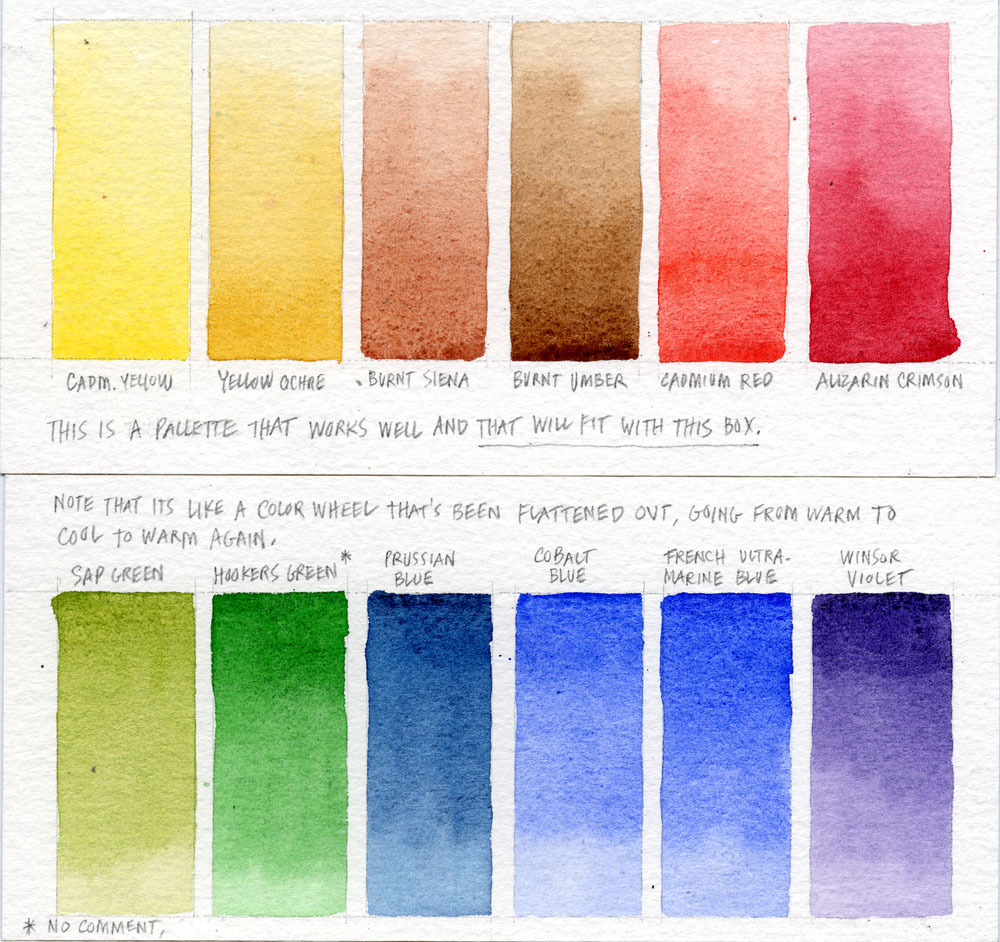
In the examples below, I have you use four different pairs of colors generally thought of as "opposites across the color wheel" to create grays. For those of you who like lists (and who doesn't?), those color pairs are:
Burnt siena and Cobalt blue (known as a "sedimentious" pair for reasons I'll discuss elsewhere)
Yellow Ochre and…
(If you have enjoyed this post so far, please consider buying the soft cover book or e-book version by clicking below. Thank you!)
Architizer Article on the Continuing Impact of Hand Drawing
From author Eric Baldwin on Architizer click (link here):
“As a profession and an art, architecture has long been defined by a dependence on line and delineation, by the need to describe buildings and spaces. Consequently, for the majority of human history, the ability to draw by hand was central to the practice of architecture. But as Computer Aided Design (CAD) and digital technology became popularized, the role of hand drawing has been questioned.
Today, the debate continues: What is the role of hand drawing in contemporary practice? This question lies at the heart of Architizer’s global ideas competition, the One Drawing Challenge. Both hand drawings and CAD drawings are eligible for the competition, and it will prove fascinating to see which medium entrants choose to tell their visual stories.
The following collection looks at the different ways in which architects have utilized hand drawing techniques to represent buildings over the decades, from traditional drafting to modern, graphic imagery. Their incredible variety points to the fact that, as a medium, the storytelling power of hand drawings are limited only by the imagination of their creator.
Will hand drawing ever die out? If these sketches are anything to go by, don’t count on it.”
The article is full of excellent images showing the hand-drawn “parti” and the final building. Worth a look.


From My Perspective

Good things really do happen when you expect them the least.
For years I’ve been on the lookout for good ways to explain the advantages of designing and rendering by hand with Procreate, versus traditional designing and rendering by hand with pencil on paper. I haven't found the exact right words yet, but I keep looking.
Then this morning I woke up and saw on Twitter that the cartoonist Gary Larson was starting to cartoon again. He retired from drawing "The Dark Side" about 10 years ago, but according to this announcement he was starting to draw again-- for fun. Not the deadline-based, cartooning with which he entertained the world for 15 years, but drawing for his own amusement. Naturally my interest was peeked! But then it got better.
Gestural Concept Sketching Techniques for Use with Procreate Over Sketchup
The Answer to "What Size IPad Pro Should I Get?" The Biggest and Fastest, Period

Bottom line? Layer management and drawing file size are manageable (for some very conscientious people), but sometimes you need to put technical limits completely out of mind and just draw…fast. With my work, that is more or less every job 24/7/365. And the best hardware for that is the one where speed and storage capacity is state of the art. So if you, like me, have to support yourself with your iPad Pro…
Procreate, Architecture & Design: Sketching as an Essential Step Before Digital Photorealism
Procreate, Architecture & Design: Sketching As Part of the Design and Presentation Process
Procreate, Architecture & Design: Making a "Twilight" Sketch of a Hotel Rooftop in 2 Hours

Getting to Know Procreate's Perspective Assist Tool (1-Minute Masterclass)

Strategic Use of Layers to Make Multiple Versions of a Rendering: Procreate Masterclass
In this video, architect and illustrator James Akers demonstrates how to add hand-drawn life and energy to basic Rhino and Sketchup views, then creates 9 different "events" within the rendering to feature the flexibility and fun of the proposed courtyard design. Thanks for watching and please subscribe for more like this.