


Attention Pinterest Visitors: I produce weekly video tutorials on painting, drawing, and architecture illustration. Please subscribe to >> YouTube << for videos on each technique. Your support means the world to me!
This is the shortest, easiest to read blog post ever written about watercolor. The idea is to get you over the hump and painting within minutes. Why? Because you are a procrastinator and you know it (or you wouldn’t have started reading this article instead of painting yourself) So start reading and I want to see that paint fly. Ready, go.
WHY SHOULD I WATERCOLOR?
Because it’s a really cool thing to do, and its fun, and you’ll feel really good about yourself. Plus it helps you see the world around you and become one with the moment. And did I mention you’ll have a little painting to be proud of and keep for your grandkids?

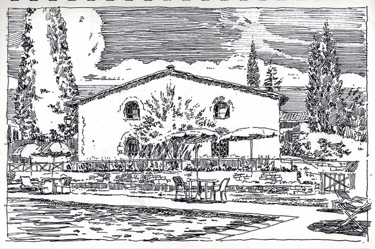
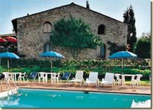
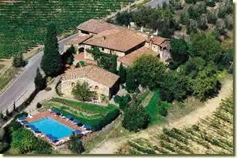
A little painting to be proud of and keep for your grandkids
WATERCOLOR IS A TOOL
Watercolor is a tool for seeing…and communicating…and other stuff, too. If you think of it as a tool, you are less likely to think of it as something precious and hard-to-do and any of the other excuses you’ve come up with before deciding this is the day to begin. On the other hand, if you do think of it as a tool you are more likely to lend it to a friend who will never return it, or leave it out in the rain at a friend’s house and get your dad all mad.
WHAT YOU NEED
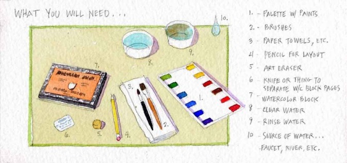
You are going to need water, paint, a palette, a brush, and some paper. If you don’t have these already, go get them at an art store. What helps make this book so short is that I don’t tell you which brushes or colors or paper to get.
Just kidding…see list below where I tell you what to get. The next couple of photos show you the set up I use when doing watercolor architectural renderings, just so you can see I'm not making up that I use this stuff.

Another little painting you could keep for your kids, come to think of it

Here's one example of how the palette and brushes described in this post might look in the real world. Notice the paper towel and strips of scrap paper used to test the color and opacity of the watercolors I mix before painting
BRUSH: get a nice brush with a nice pointy tip and around a size 8.
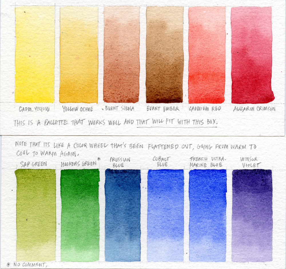
PAINTS: get a tube of cadmium yellow (T), yellow ochre, alizarin crimson (T), cadmium red, French ultramarine blue (T), Prussian blue, burnt umber, sepia, winsor violet, hooker’s green, and sap green.
PAPER: Buy a small watercolor “block” which means a pad of watercolor paper that is sealed along the edges so the pad keeps the top sheet from warping. Get a small size for starters, say about 6 x 9”.
PALETTE: Get something with enough little paint holding areas for the paints above, and with bigger, shallows areas for mixing the color you want.
COLOR THEORY
Color is simply…well…actually there have been a ton of longer books written about color. For our purposes, color is what you are trying to copy from life onto an empty, terrifying little piece of expensive paper, with no guarantee that you’ll ever show the result to anyone, using only some strange liquid in a tube, a little brush and some water.
BUT SERIOUSLY
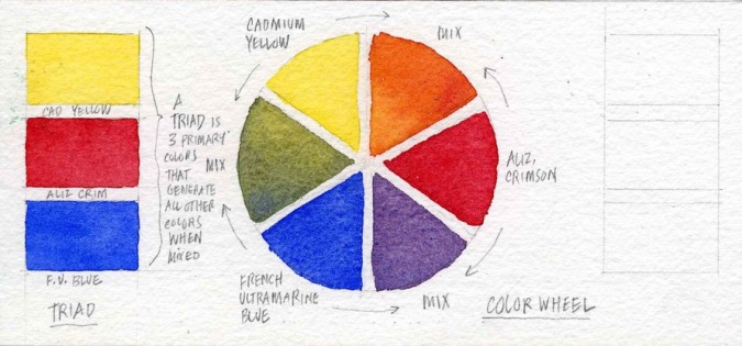
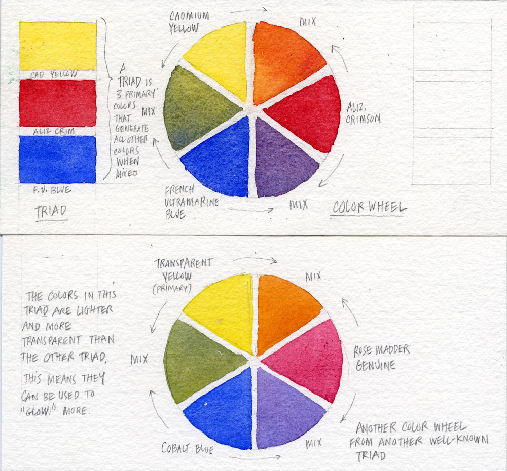
One word: triad. Believe it or not, you are going to use the theory of the color wheel and the color triad to make your little paintings. The color wheel is easy: It consists of three primary colors (yellow, red and blue) spaced equally around a “wheel.” Next come the three secondary colors, located between the primary colors, and created by mixing the two primary colors on either side of them. In other words, red and blue make violet; red and yellow make orange; and yellow and blue make green. Never mind for now that you can’t get every green or every orange or every violet you’d like to get from mixing primaries. But the reason we call the primaries chosen in this book a “triad” is because they have become known over the years to artists as producing the nearest misses in trying to get all colors. They are particularly good at getting there, especially with the help of the few secondary colors we throw in to our shopping list in the previous chapter.
PALETTE
Once you understand the basics of the color wheel, it is helpful to have a plan for how to access these colors. I use the following approach to laying out my palette (see photo below, and photo of real-world palette above). Basically, I just distribute the colors in the order they appear on the wheel around my rectangular palette. The idea is to keep opposites across the palette from each other, and to keep your palette as clean as possible by having similar colors close to each other. That way any splashing that occurs as you mix colors won't overly-pollute the colors next to them.
MIXING COLORS
The best way to introduce the idea of mixing colors is to have you mix the ugliest color: gray. (We're going to mix abut 50 shades of it, so make sure you're in a safe place.) Why gray? Because gray is what you get when you mix opposites on the color wheel. Mixing gray will help both your understanding of the color wheel and your understanding of another concept: color temperature. What is color temperature? It's the degree of warmth or coolness found in a color, usually having to do with the amount of red or blue found in the color. But we get ahead of ourselves. Let's try mixing some grays.
In the examples below, I have you use four different pairs of colors generally thought of as "opposites across the color wheel" to create grays. For those of you who like lists (and who doesn't?), those color pairs are:
Burnt siena and Cobalt blue (known as a "sedimentious" pair for reasons I'll discuss elsewhere)
Yellow Ochre and Windsor violet
Cadmium red and Prussian blue (a dye-based or "stain" based pair, because of the extraordinary staining power of Prussian blue)
Burnt Umber and French ultramarine blue
Each of these pairs, when mixed with more or less of the warm color with respect to the cool color, is capable of producing a warmer or cooler gray. Each of these pairs also produces a subtly different gray which, with practice, you will come to know exactly when you want to use. To get started, create an arrangement that features each color in its own small area, then a larger area of the mixed gray between them, with the warm color more dominant on one side, and the cool color more dominant on the other. I chose the silly configuration below, but feel free to use any kind of shape you please. I'll be sure to note your design when I see it posted to your Pinterest page.

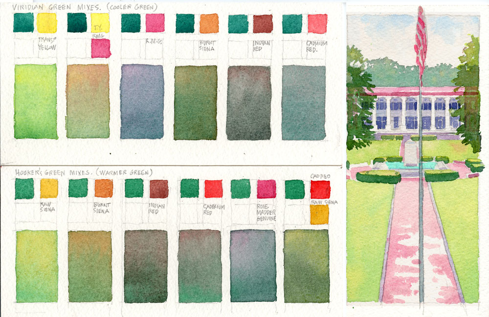
Seems simple, right? That's because we haven't done greens yet. Greens are a whole other ball of wax. I once heard someone say that green is the most difficult color to mix because everyone--whether they are an artist or not--knows the right green when they see it. That makes sense when you think about it, because we've all spent our lives in Nature, where Mother Nature reminds us each day that this green is for Maple leaves, this green is for grass, and so on and so forth. It just permeates our brains. But wake up one day and see the two greens switched and even a baby knows something is wrong. For that reason we will stay away from mixing greens.
Just kidding. Below is your exercise for beginning your life long struggle to mix the right greens. Its so complicated that I won't even try to describe it in words, although I have helpfully labelled each of the greens in the exercise below. Just imitate my exercise first, then bust out on your own. The important thing is: keep mixing greens all your life and you may--just may--get one right someday.
Thanks for getting this far. When I originally published this post I was using Squarespace 5, then Google began pushing people to use mobile-friendly Squarespace 7* and I switched over. During the transition some writing and images were lost, so I am rebuilding the original post as time permits. Stay tuned for updates, and thanks for reading this far. Here, in the meantime, are the remaining photos that accompanied the original post.