


Dear Pinterest: By popular request “15 Of The Dumbest Things You'd Ever Want To Know About Watercolor Technique...That Work Every Time” is now available as a soft cover 7” x 7” book, e-book, or convenient phone-sized .PDF. To see purchase options click button below, and thank you for your support!

Excerpts from the book:
INTRODUCTION
This is the shortest, easiest to read book ever written about watercolor. The idea is to share with you 15 of the “dumbest” (i.e. simple; time-saving; true) things I wish someone had told me when I was first learning. Why? Because you are a procrastinator like me and I want to make it easy and fun for you to get over the hump. So read it in a short checkout line, or open it next to your new palette, then I want to see that paint fly, OK? Go.
WHY WATERCOLOR?
Because it’s relaxing and fun, and you’ll feel really good about yourself. Watercoloring helps you see the world around you and live in the moment. And if you do the exercises in this book you’ll have lots of little little paintings to be proud of and keep for your grandkids.

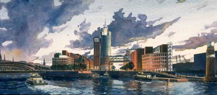
A little painting to be proud of and keep for your grandkids
#1: KEEP IT SIMPLE
Keep your subjects simple and you’ll paint every day. Keep your art supplies simple and you’ll use them more. Keep your ambitions simple and you’ll be more forgiving. Keep your resolve simple and you’ll practice more often.
The opposite of complexity is simplicity. The more complicated the steps in learning something new, the less likely we are to try it. Therefore #1 dumb thing in this book is “Keep it Simple.”

Watercolor is just “color juice” as my friend Clark Smith says.. Play at it, and you can only get better

#3: TRANSPARENT MOTIVES
The main difference between watercolor and oil or acrylic is that it dries quickly and remains transparent after drying, so the color of the paper and any paint already applied shows through layers of new paint. The effect is sometimes referred to as “glow.”
To see what I mean, replicate the exercise above with thin layers of paint, letting each layer dry before applying the next (about 30 to 45 seconds should do; shorter with a hair dryer). Try to leave some tiny gaps between brush strokes, so glimpses of the underlying paper and paint persist to the end.
Be sure to leave gaps in your brush strokes where the paper and paints under each new layer can show through
These primary colors are known for their staining properties and relative lack of transparency, They allow less light to pass through to underlying paper and paint, but often they’re exactly what you need
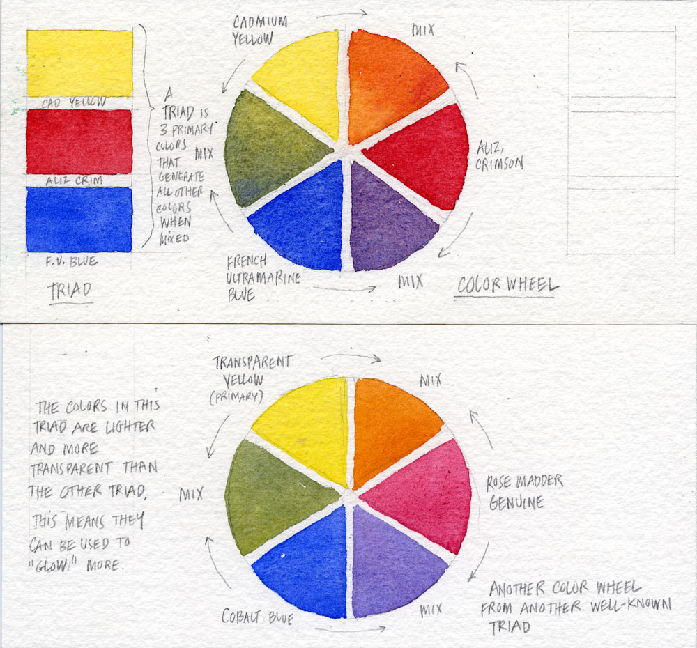
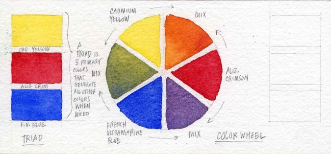
#4: LOVE YOU SOME TRIANGLE
The color wheel helps us visualize the relationships between primary and secondary colors. It begins with a “triad” of three colors—yellow, red and blue—spaced equally around a “wheel.” Next come the three secondary colors, located between the primary colors, and created by mixing the primaries on either side.
Can you get every shade of every color this way? No, but depending on the particular primary colors you use, you can get close. Should you need more colors, Mr. Winsor & Mr. Newton have your back.

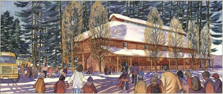
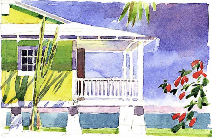
Another little painting you could keep for your kids, come to think of it

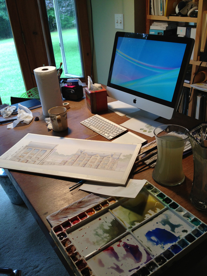
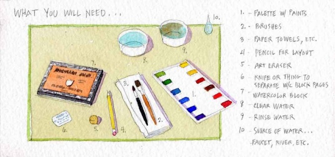
Here's one example of how the palette and brushes described in this post might look in the real world. Notice the paper towel and strips of scrap paper used to test the color and opacity of the watercolors I mix before painting
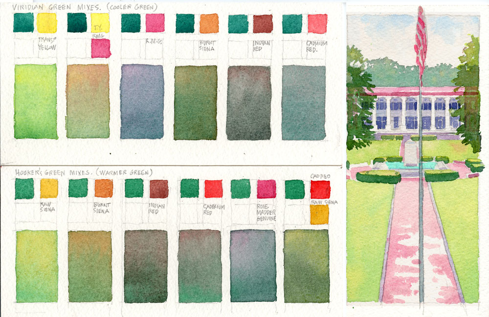
MIXING COLORS
The best way to introduce the idea of mixing colors is to have you mix the ugliest color: gray. (We're going to mix abut 50 shades of it, so make sure you're in a safe place.) Why gray? Because gray is what you get when you mix opposites on the color wheel. Mixing gray will help both your understanding of the color wheel and your understanding of another concept: color temperature. What is color temperature? It's the degree of warmth or coolness found in a color, usually having to do with the amount of red or blue found in the color. But we get ahead of ourselves. Let's try mixing some grays.
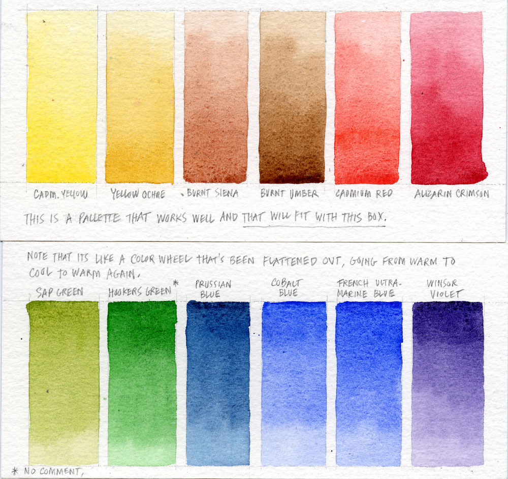
In the examples below, I have you use four different pairs of colors generally thought of as "opposites across the color wheel" to create grays. For those of you who like lists (and who doesn't?), those color pairs are:
Burnt siena and Cobalt blue (known as a "sedimentious" pair for reasons I'll discuss elsewhere)
Yellow Ochre and…
(If you have enjoyed this post so far, please consider buying the soft cover book or e-book version by clicking below. Thank you!)