


(Note: Welcome to the startup and angel investor community on LinkedIn. Please visit the portfolio portion of this site to see other examples of architectural--building, software or otherwise--visualization techniques.)
Entrepreneurs have a lot on their plates--finding pain points to solve, raising funds, choosing between iPhone, Android, and now iPad platforms, cutting through crowded marketplace noise, etc. Great ideas must elegantly solve pain while being fun to use, hyper-efficient to navigate and joyous to spread. UX (user experience) designers know they're going to lose half of their audience with every click, so making mobile and web apps simple, stunning and "sticky" is job one.
UX design is central to any web 2.0 start up conversation. There are many wireframe programs available to help, but the medium is the message, and these aides tend to make the apps they help create look the same. Why not follow the lead of movie directors and entertainment designers and use storyboards to nucleate your vision, get team members on the same page, and communicate to investors in a striking and company-differentiating way?
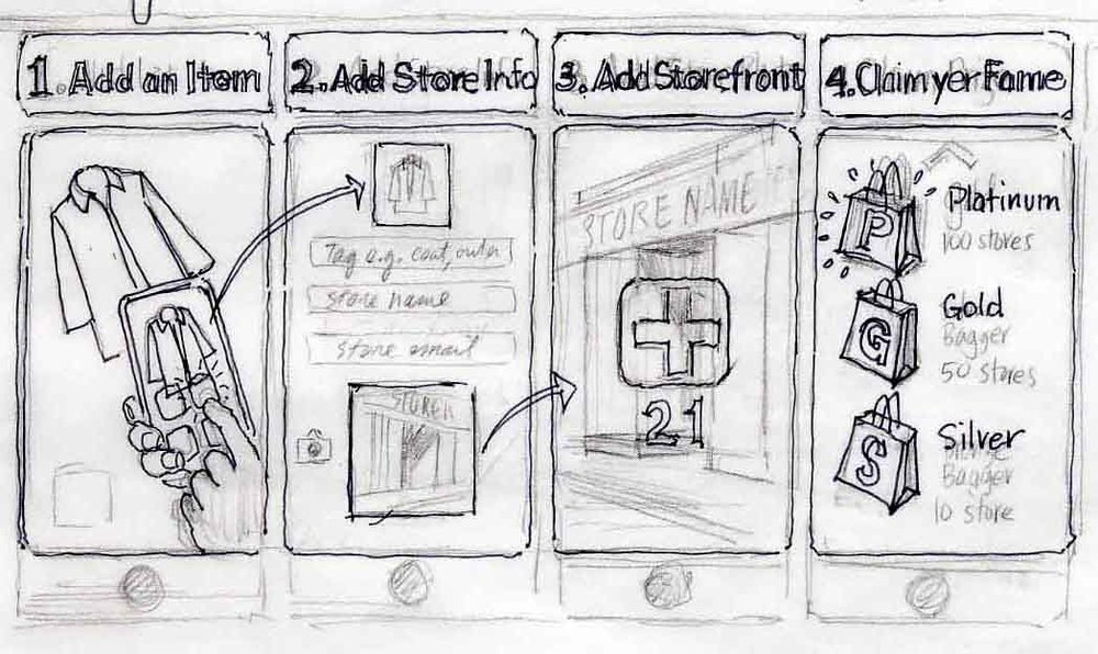
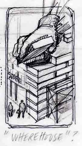
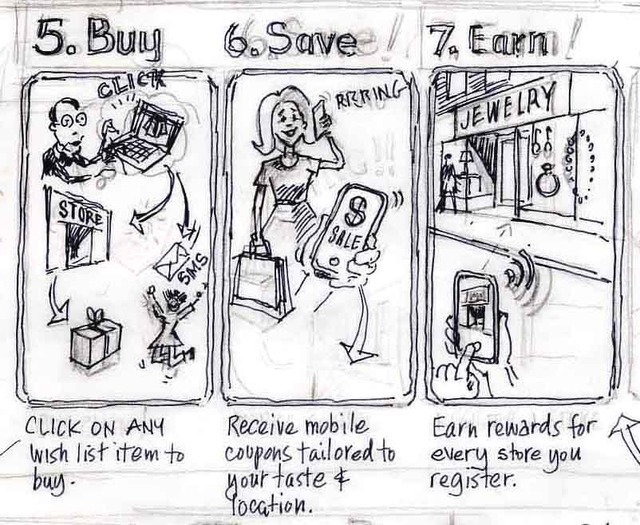
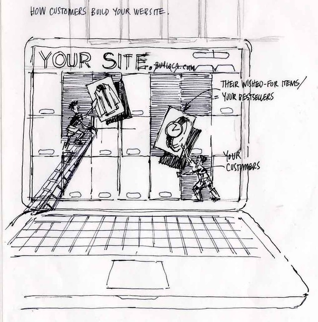
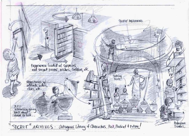
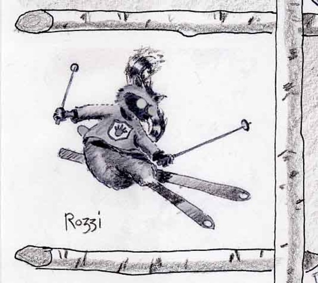
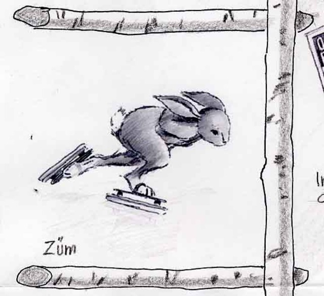
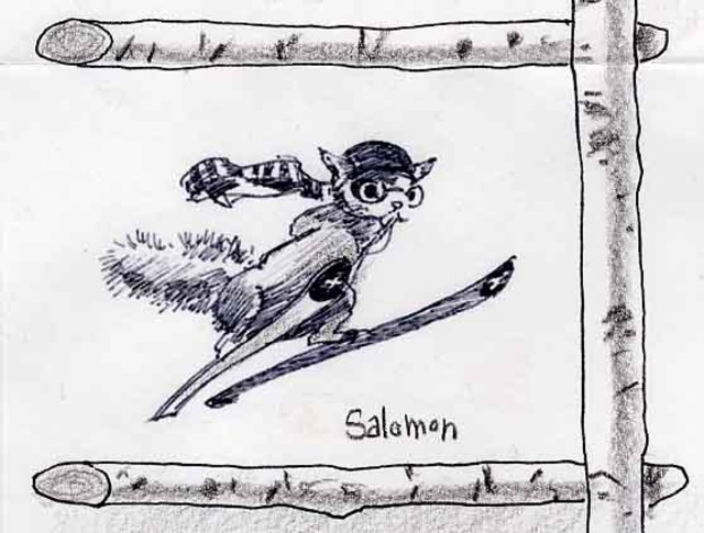
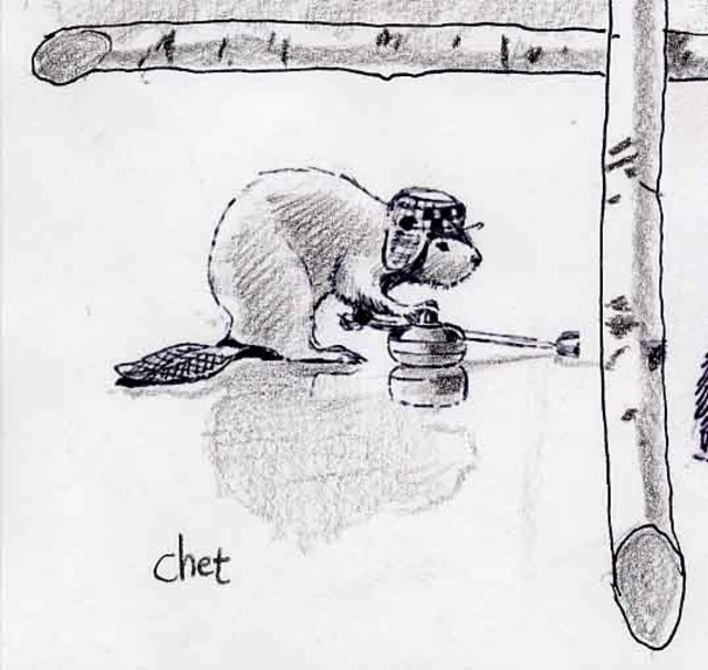
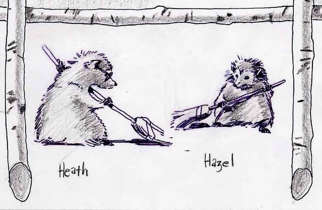
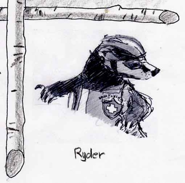
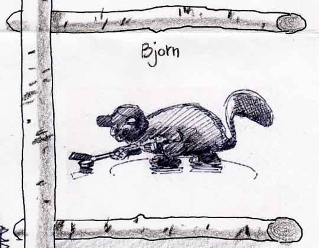
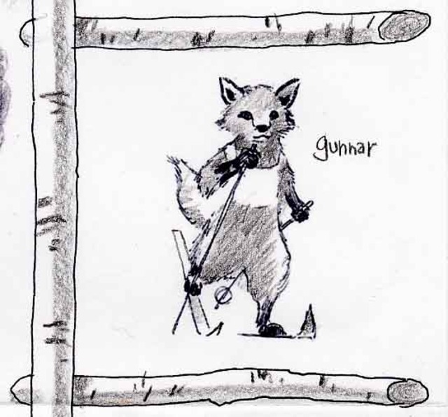
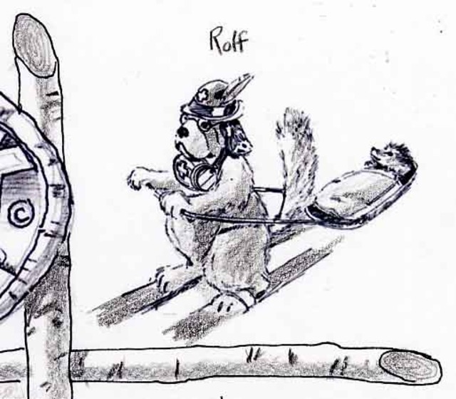
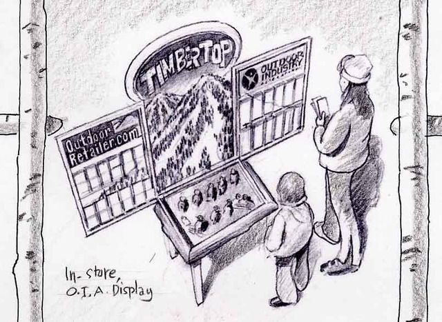
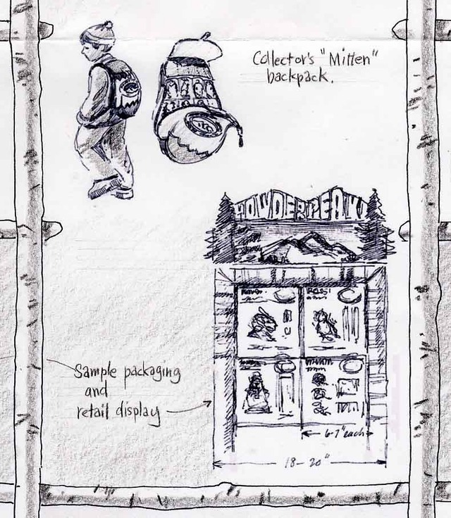
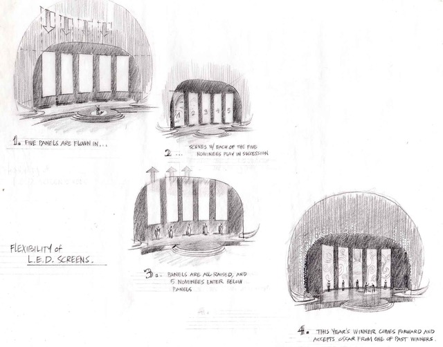
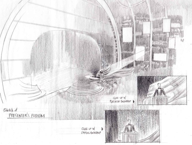
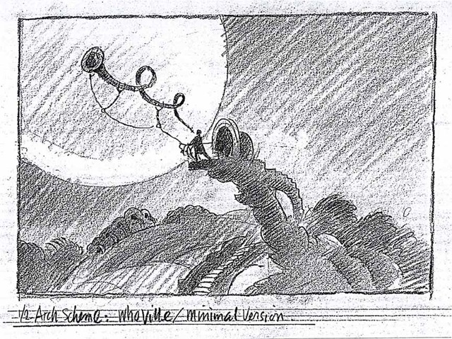
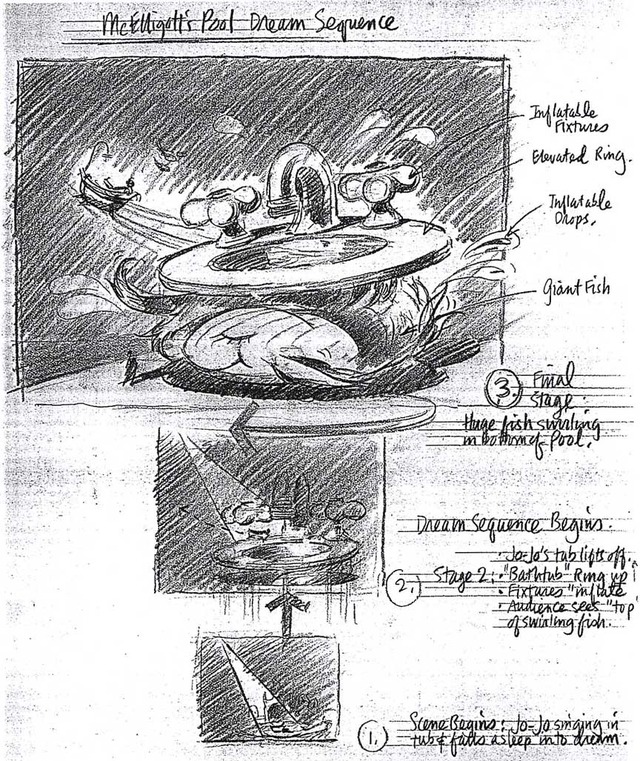
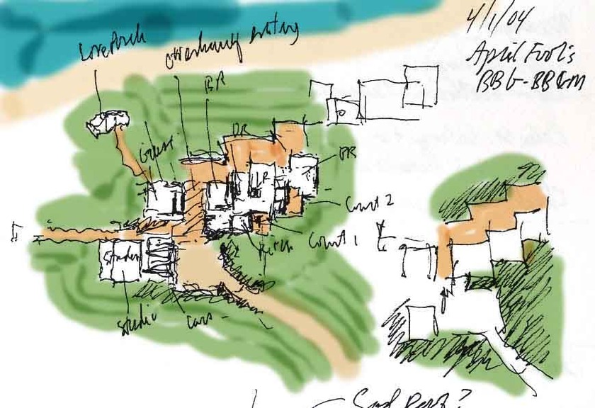
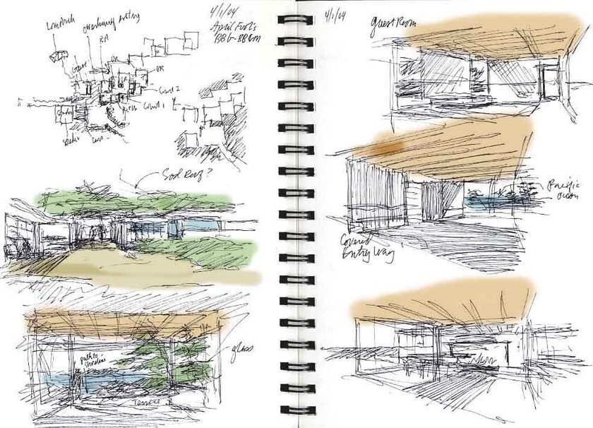
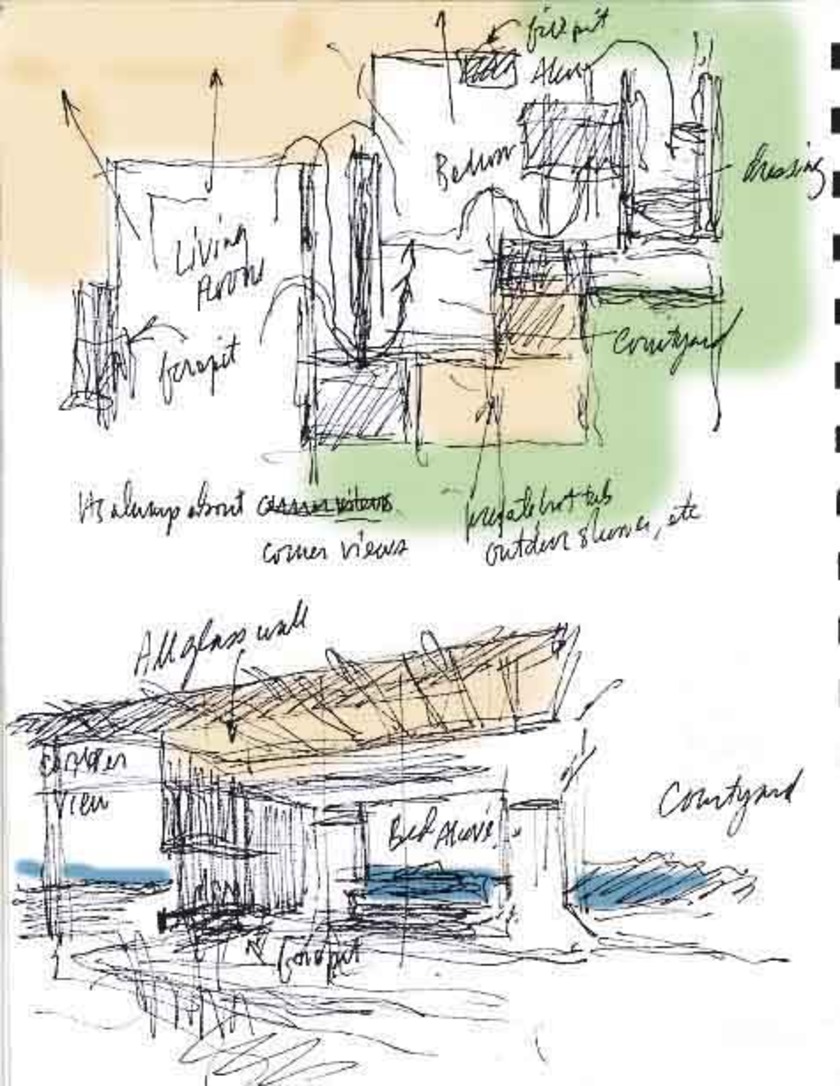
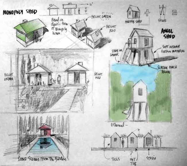
Taking the metaphor a bit further, UX design is a lot like set design (see samples included) only your stage is held in the palm of your hand (on your mobile device). Providing examples of storyboarding will be a recurring theme in this blog, beginning with some in-progress and very rough UX sketches for a social mobile start up being developed right here in western Massachusetts. (Yes, western Massachusetts. Afterall, we were home to Bo Peabody and Matt Harris's Tripod, so we can certainly do it again.) These begin as rough pencil sketches made in real-time working with developers around a table, and evolve after many iterations into publishable memes that tell your story. I can't tell you much about the startup idea involved here, but the clever ones among you may figure it out.
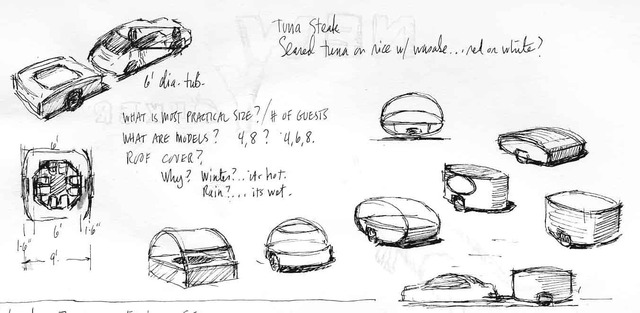
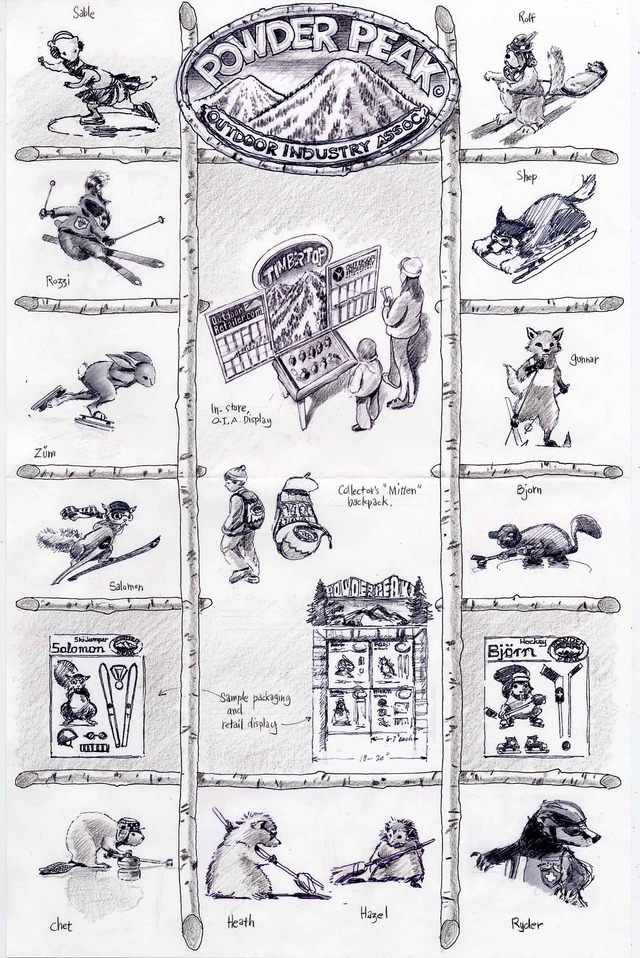
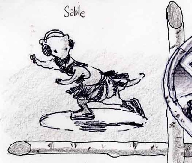
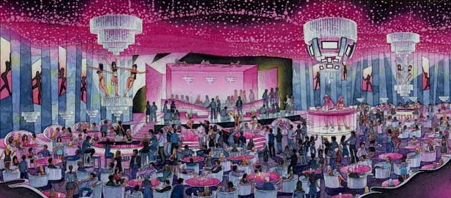
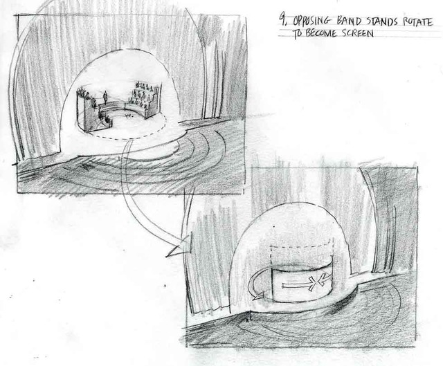
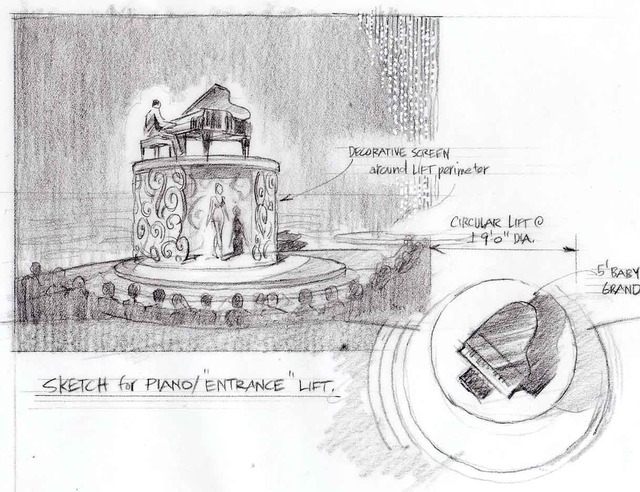
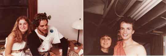
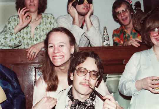
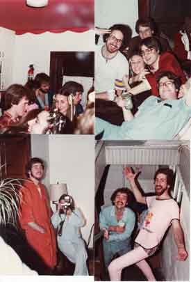
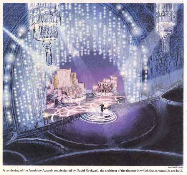
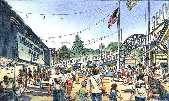
That's it for the UX stuff I can show on this project. Below are a sampling of storyboards made in collaboration with famed set designer/architect David Rockwell, and several other firms doing work in the entertainment industry.

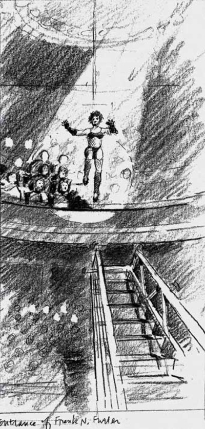
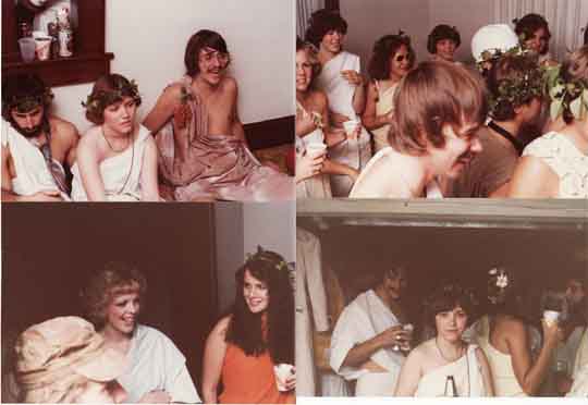
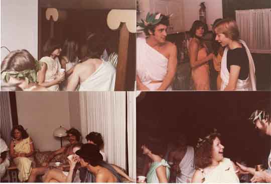
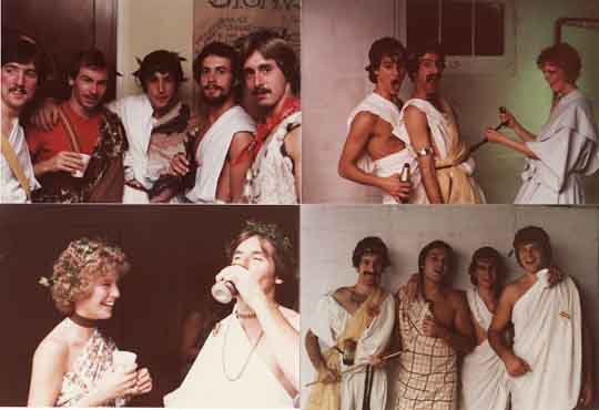
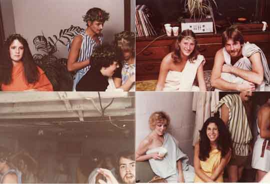
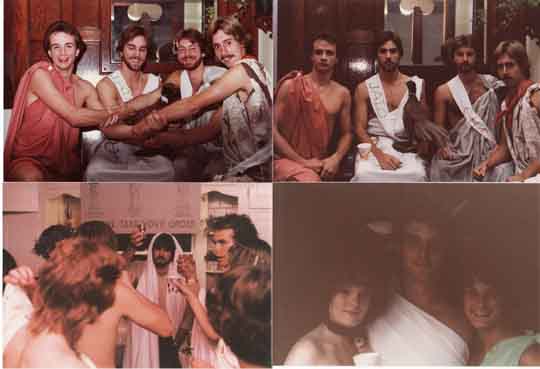
The moment of Frank's Entry in the staged production of Rocky Horror Picture Show.
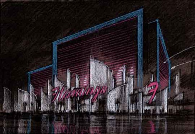
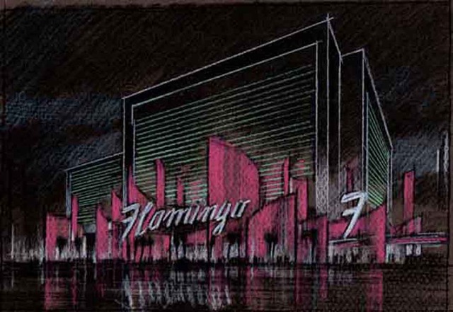
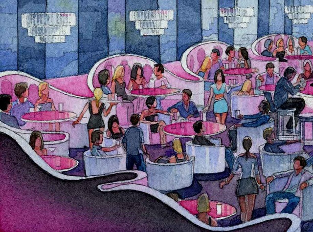
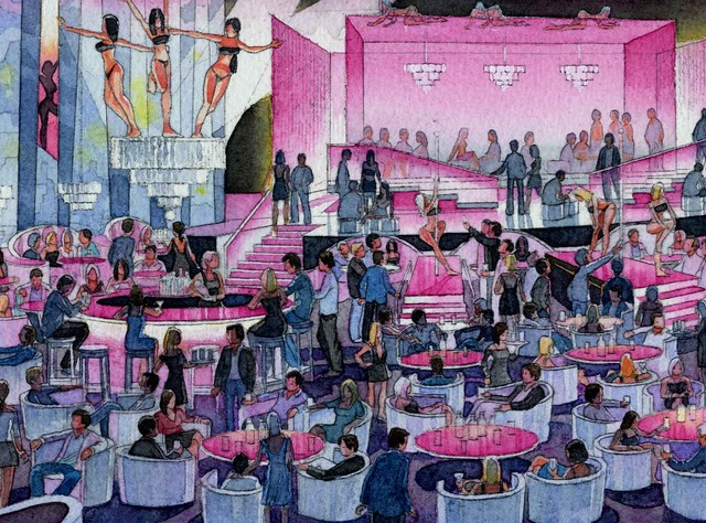
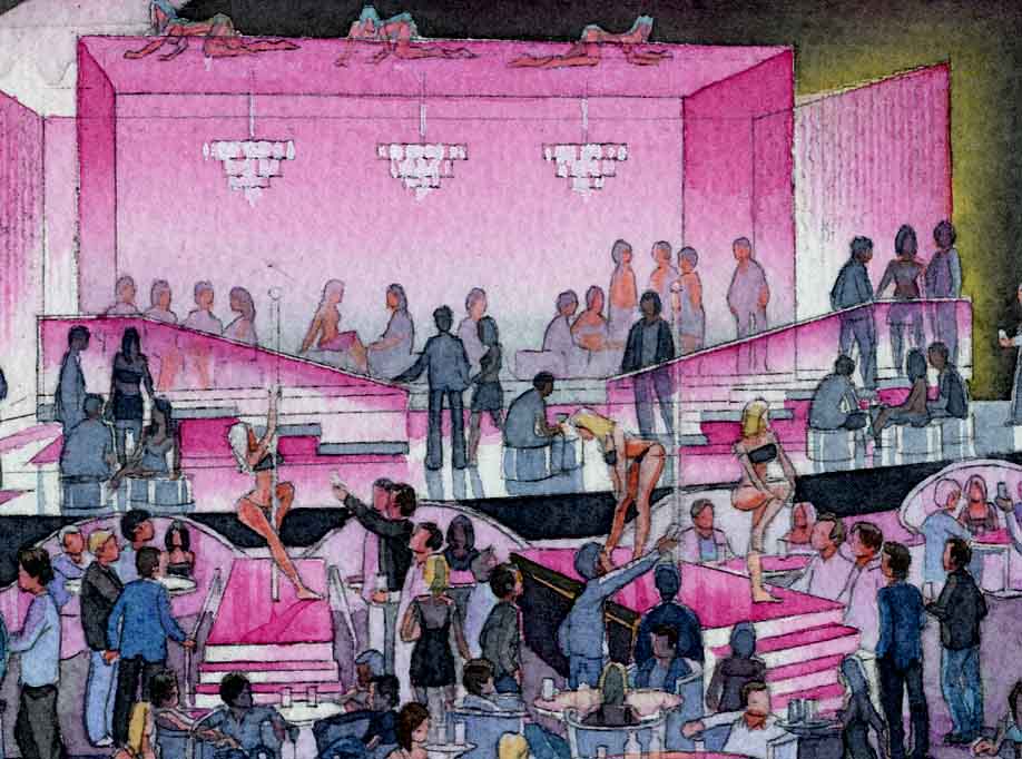
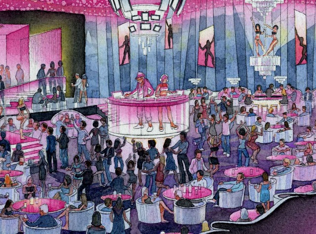
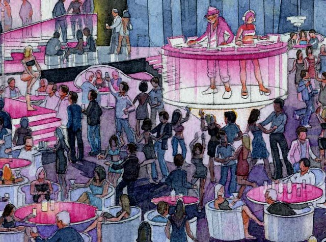
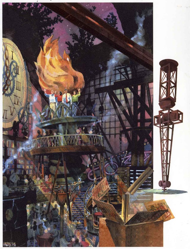
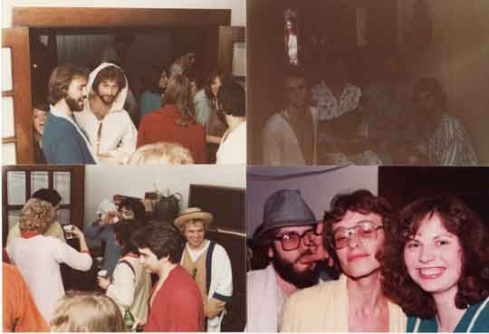
Studies for the "reinvention" of the aging Flamingo Casino in Las Vegas.

Thanks for coming, and please stay tuned for more on how storyboarding can help your startup (or startups if you're an angel investor) focus team effort and get to launch faster.
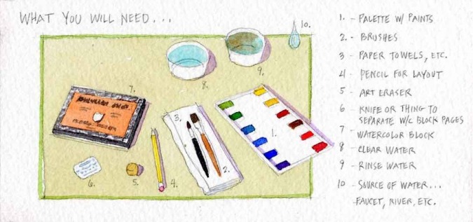
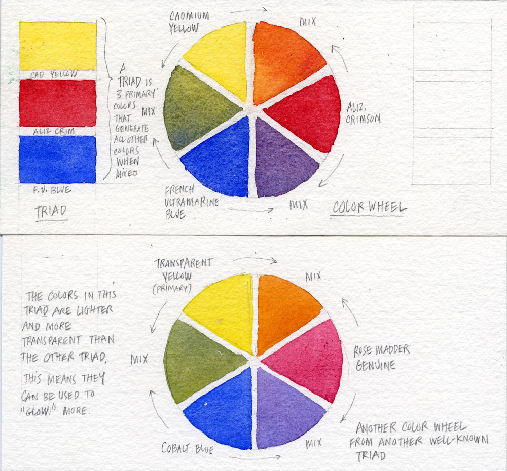
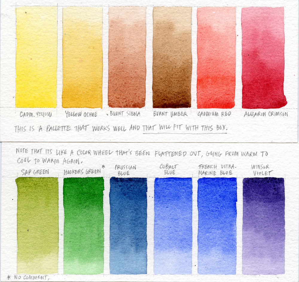
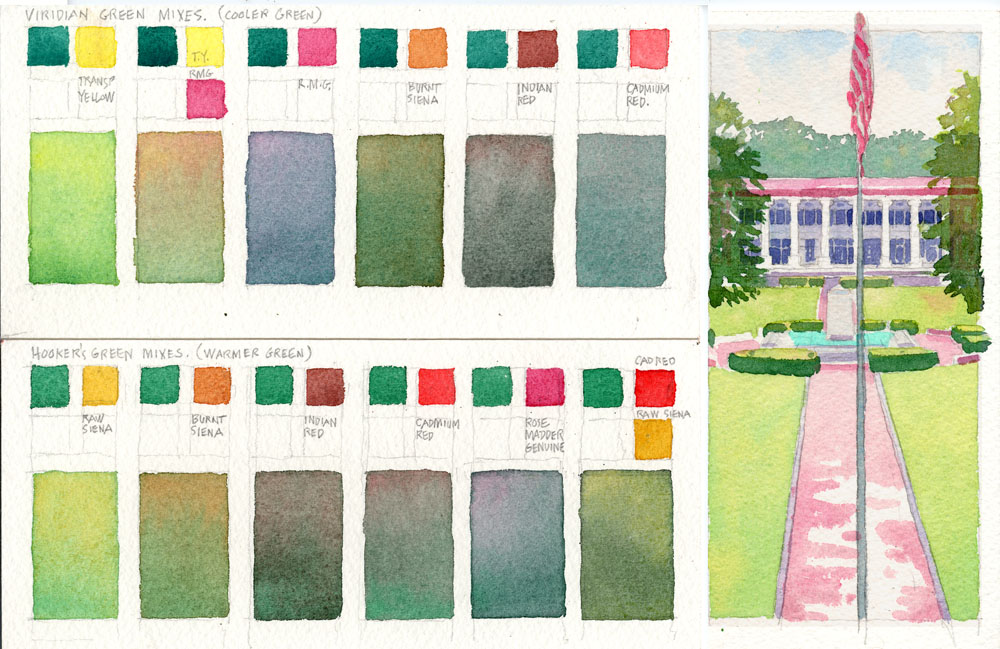
Appendix: Here are some keywords which will help readers index this article:
architectural rendering
watercolor techniques
architectural renderings
architectural rendering techniques
watercolor rendering techniques
pen and ink techniques
watercolor rendering
watercolor techniques
architectural sketches
watercolor rendering techniques
watercolor techniques
architectural watercolor rendering techniques
pen techniques
different watercolor techniques in rendering
architectural sketching
pen and ink
sketching techniques
architectural rendering in watercolor
rendering watercolor


